We're doing a geospatial project at work, and Voronoi diagrams came up. I hadn't heard of them, so did a Google image search. To my surprise, it was beautiful!
I mean, would you look at that:
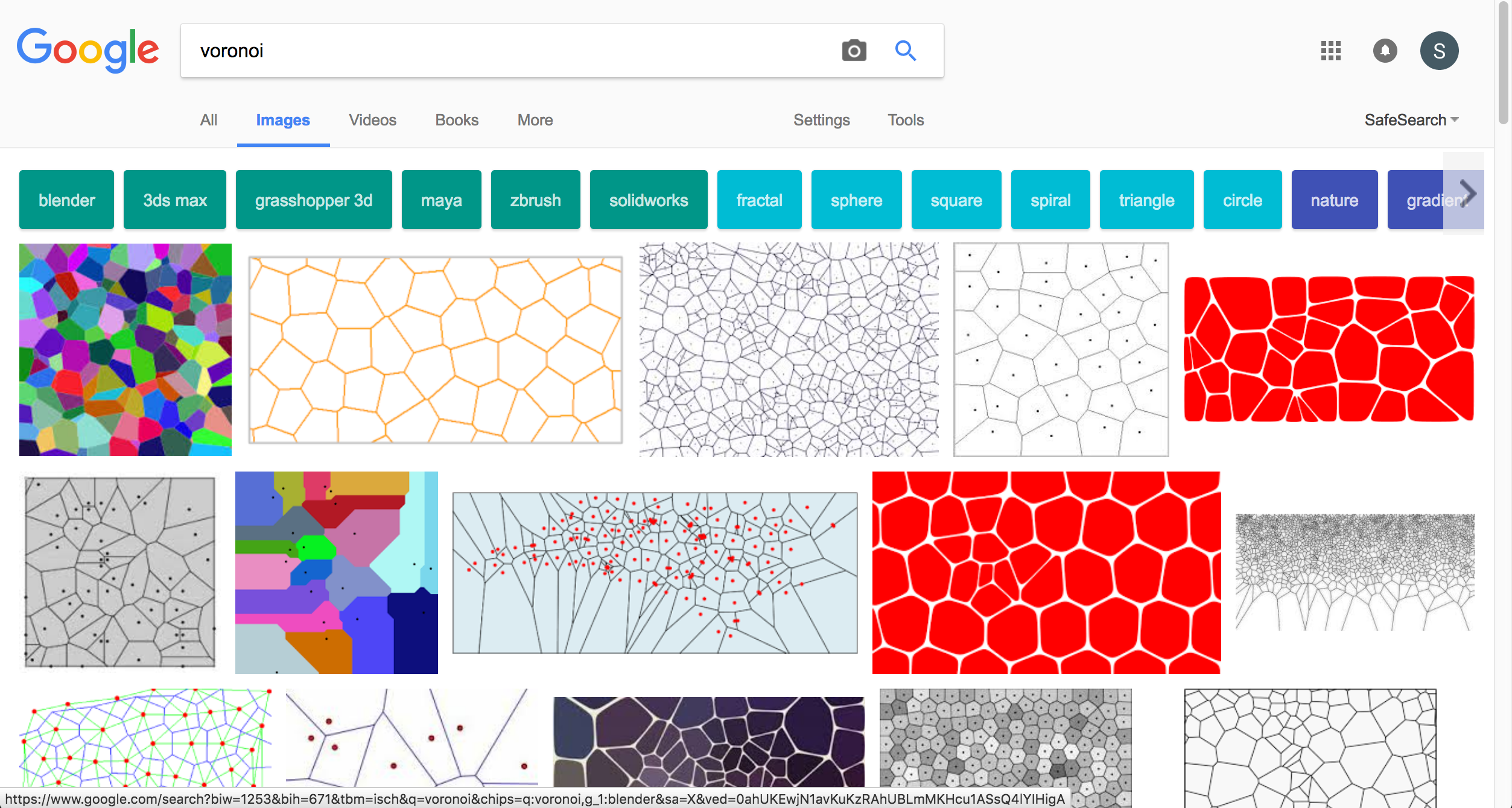
Just gorgeous.
From Alex Beutel's blog, more on this in a minute.
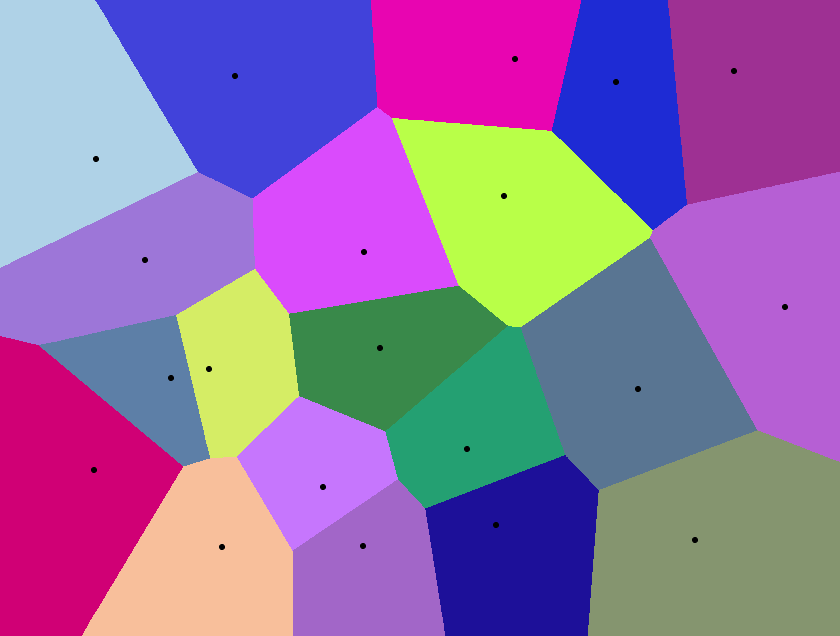
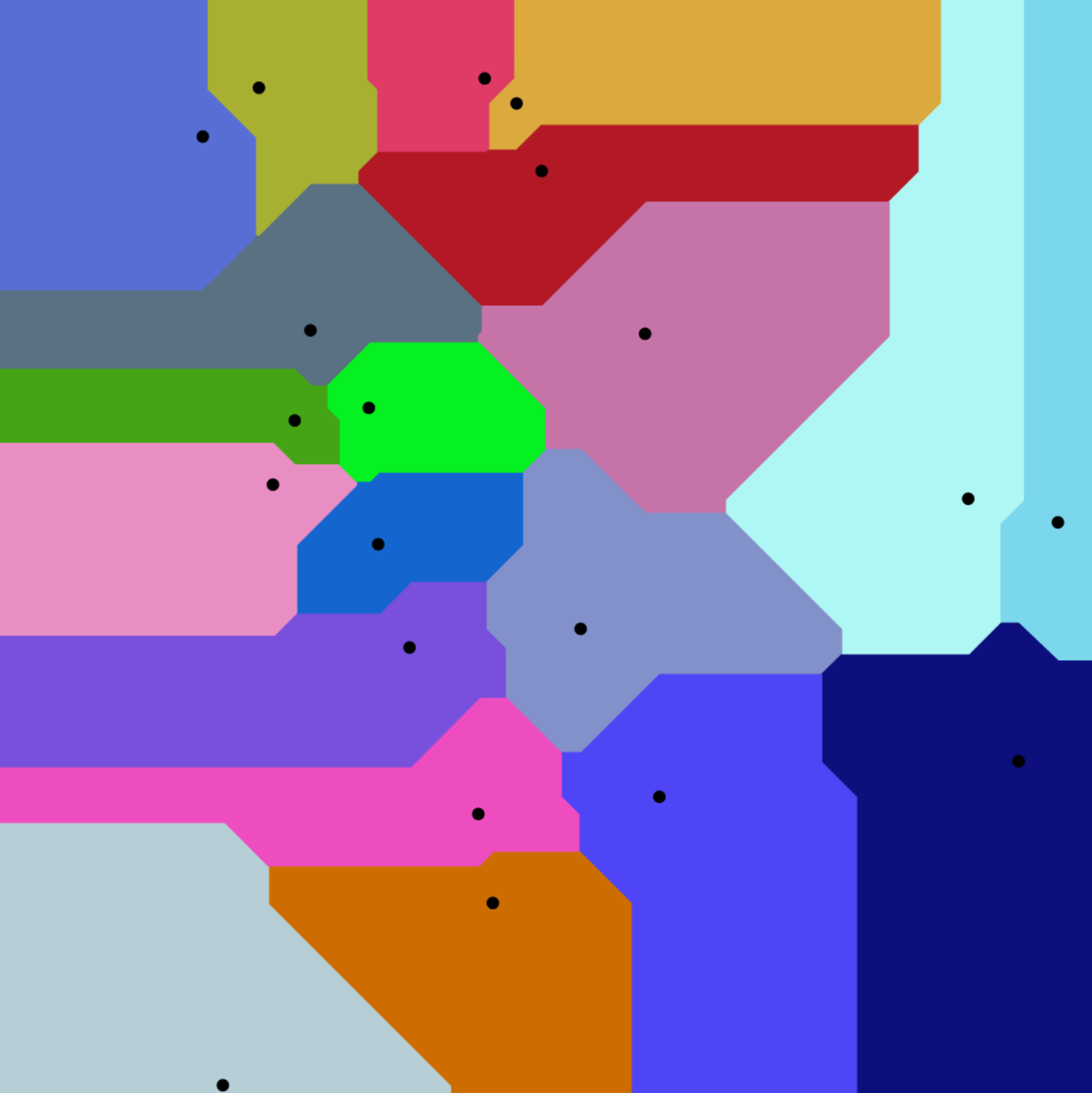
So what are these? Each of the spots is a point of interest, like a store in a city. Every colored splotch on the map has the same closest store.
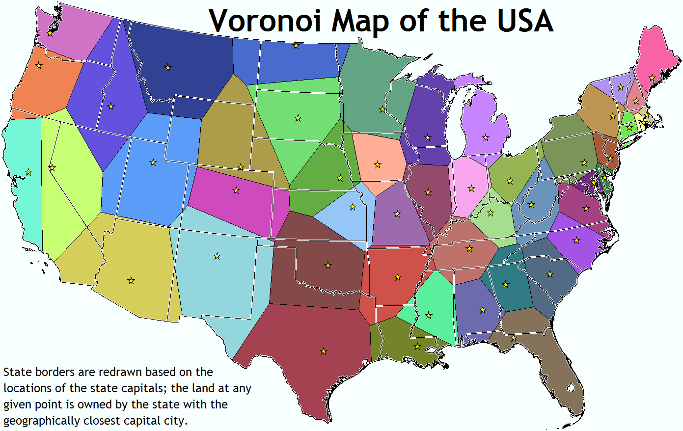
State capitals are important, right? What if the states were defined by the closest state capital?
There are a few interesting things that fall out of this simple rule. For instance, every point on each line segment the exact same distance from the two nearest capitals. As you move along it, you get closer to both capitals and then farther from both capitals, but it would be exactly the same to go to one or the other.
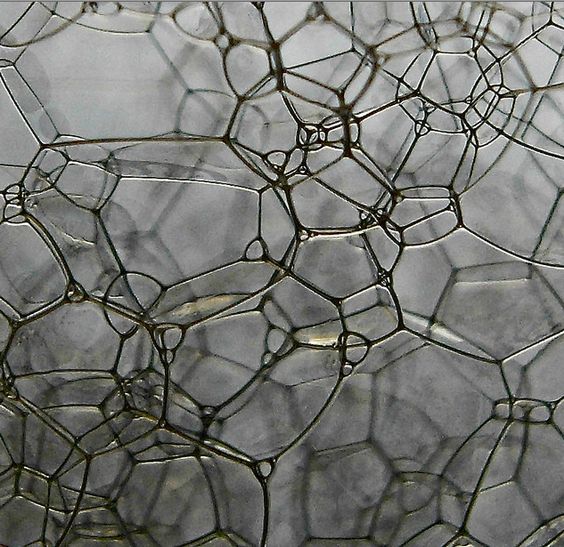
You also start seeing this pattern emerge in nature. Like when you put bubbles together, they settle down into a 3D Voronoi diagram, their membranes farthest from the "center" of each bubble:
You can also use all kinds of distance measurements. No need to stick to "crow flies" distances. Here's a Voronoi diagram using "Manhattan distance," which is basically how far you'd have to walk if you were a pedestrian in a city:
Want to see diagrams of points in motion? Check out the videos on Alex Beutel's website.
If you think this stuff is cool, check out all the examples and uses of it on Wikipedia!
UPDATE: Carlos Rey pointed me to this Voronoi Reese's cup!
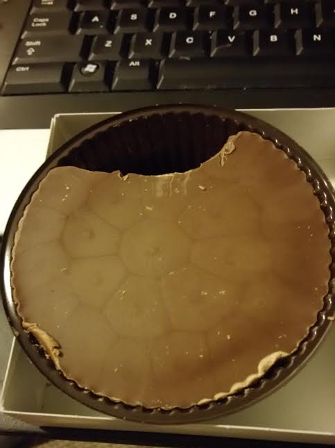
from Reddit